Report
WOLAND provide different set of outputs depending on the script used - and how far you want to go in your mutational pattern analysis. woland-batch.pl runs the most complete analysis but you must have at least two groups of samples (a control and a treated group, for example).
Note
woland-batch.pl provides the faster and straighforward way to analyze samples. It runs woland-anno.pl for each sample then runs woland-report.pl to build the report.
Graphical report
woland-report.pl uses outputs from woland-anno.pl to build a comprehensive grouped analysis with some R graphical data. Those outputs are saved as graphical data as .SVG and .PDF files and a tabular text file (.tmp) for each graphic;
Note
All woland-report.pl outputs were saved in the folder report-$input_table/. You can use .tmp files to build your own graphic or use a statistical approach to test your hypothesis.
Nucleotide type-changes
- Point mutation frequency across chromosomes:

This barplot shows mutation frequency of each group in all chromosomes with standard deviation as error bars. It also shows an average line point mutation frequency for each group.
Warning
Woland uses the <chromosome_profile> file to calculate mutational frequency. If <chromosome_profile> was build using a targeted-enriched .bed file only those regions were used in the frequency calculation, for example.
Tabular text file:mutfreq-$input_table.tmp
- Number of nucleotide type changes:

This box-plot graph show the absolute number of each nucleotide type change of grouped samples.
Tabular text file:nucleotide_type_change-$input_table.tmp
- Frequency of nucleotide type changes:

This box-plot graphic shows the frequency of each nucleotide type change of the grouped samples. Y-label “value” means the number of each nucleotide type change in each sample divided by the total number of point mutations detected in each sample.
Tabular text file:nucleotide_type_changeF-$input_table.tmp
- Transversion & transition rate:

This stacked barplot graphic shows the frequency of transversion & transition rate of each sample analyzed grouped by name.
Tabular text file: transitiontransversionF-$input_table.tmp
Hotspots
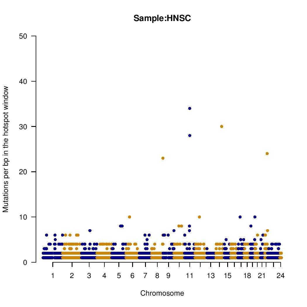
A manhattan plot-like graphic is provided for each group analyzed. Y-axis means the number of mutation in the <hotspot_window> parameter provided in <woland-batch.pl> or <woland-anno.pl>. Gene names must be checked in the tabular text file hotspots-$group.tmp.
Tabular text file: hotspots-$group.tmp:
Mutational motifs
- Number of motifs associated with mutagens:

Box-plot graph showing the absolute number of each mutational motif sequence analyzed.
Tabular text file: motif_number-$input_table.tmp
- Number of normalized motifs associated with mutagens:

Box-plot graphic of each mutational motif sequence found normalized by the total number of point mutations of each sample file grouped by name. A value of 1.00 means that all point mutations contains the mutational motif.
Tabular text file: motif_numberNorm-$input_table.tmp
Transcriptional strand bias

Box-plot graphic of strand score (SC) concordance/discordance ratio for each mutational motif. Values = 1 means that there is no transcription associated strand bias. Values > 1 means more motifs in the same transcribed strand and values <1 means more motifs not in transcribed strand. Only SC scores equal to -1, 0, 1 are considered.
Tabular text file: SC_concordance_ratio-$input_table.tmp: